


It's easy to justify Tahoe icons (if you aren't illiterate.)

Today, I came across a blog titled "It's hard to justify Tahoe icons" in which someone was expressing opinions on how macOS Tahoe UI is "hard to use", calling it's design language as more than just a step-back, but rather unreadable for even the most experienced user. Well, I am going to dissect each of their points and explain why it is not actually as difficult to read as the author would want you to believe.
Examples: (with explainations)

There are two options for the user, icon or words. You are trying to read them both at the same time, then that’s not how you’re supposed to read. You are making it seem more complicated than it actually is.

They added + symbols to most of the icons that indicate a ‘new’ action for that icon!

Reminders have circular icons; which is why there's a + sign inside a CIRCLE icon.
A new note shows a pencil about to write on a note.
You are over-analyzing the direction of the arrow for one icon, do better.

The info icons are the same, you are intentionally rage baiting at this point. ¯\_(ツ)_/¯

No they don’t, maps still uses appropriate + and - symbols for zoom in and zoom out

No, you wouldn’t learn that symbol as ‘New’. It is in the shape of a note and a pencil, indicating notes. You’re delusional coming up with hypothetical scenarios.

Nope, it means you are editing part a document in the same Notes app. No gotcha.

This means quick, look at its info. Quick, show me the completed document. Learn how to read. It’s not rocket science.

This is correct. Importing means in the way that one imports an update on their system.

Autofilling forms you mean? Yeah, of course they’re using the same icon. you dingus.

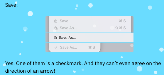
This is correct. “Save As” can be the same as “Exporting as PDF” so therefore, same icon. So far, the only thing that’s inconsistent is your observations and your ability to understand context.

Maybe it just doesn’t help you? Because, you know, you can’t read?

Two of those are for sharing, and two of those are copy. This is correct.

Also, there are line separators which correspond to those specific functions. Maybe use them?

Your whole blog screams, “I have nothing going on in my head!”
Understandable.


Yes, actually, and it tells you. As apposed to your two blue signs with a man walking to the left. Those signs supposed to convey a difference? Come on! You can do better than that!

Not slight, one is bigger and one is smaller.

Yes, that’s called a highlighter. Something you have obviously never used in school before.

You point out the inconsistent arrows when it's the box that’s going to tell you what the action is meant to do. Weak point.
You are so unserious.

No, it is different size dots throughout. You couldn’t tell? You can’t read then.

The final boss, and it’s the EASIEST menu to read BY FAR. What’s your idea? Making the up, down, left, and right arrows all point the same direction? This is correct. Good grief...

Liar. If you honestly didn’t care then why did you spend an entire week writing this monstrosity you call a blog? So that others can care even more? You are virtue signaling.
By the way, nobody cares about your so-called "trust".

I am reading these icons perfectly fine on an iPhone X 5.8 inch screen. Perfectly readable on a Thunderbolt Display too. If you cant read it better than I, maybe that's a you problem. Invest in a better monitor perhaps?

Good job! They ARE three different icons! Wow! Maybe you CAN read after all and were able read this entire time!
Don’t worry, every one can tell you struggle. And you’re pinning the blame on Apple just because you can.

You lose further by comparing Tahoe to iPadOS 26, two completely different operating systems and yet, you expect 100% consistency?

"Can you guys see the difference if I zoom in so much that you can count the pixels and analyze pixel by pixel?" Yes we can, and it’s hurting my eyes. They look exactly the same when zoomed out by the way.

Yes? And it looks like a text selection symbol. It uses a box. What is the problem here? You don’t say. It’s called character textbox. Are you not selecting characters, into a box of text? Please think.
My guess is your whole blogging career was a mistake after reading this blog.


This is the Notes app. Which will match the iOS icon in that way. You’re being intentionally obtuse in this example.

You don’t even know what a metaphor means anymore. One means select text. The other means select ALL text. It isn’t rocket science.

“Select 1 Moment” shows one moment selected.
“Select All” shows you text selection
“Deselect All” shows you a crossed out document
Again, you just can’t read.
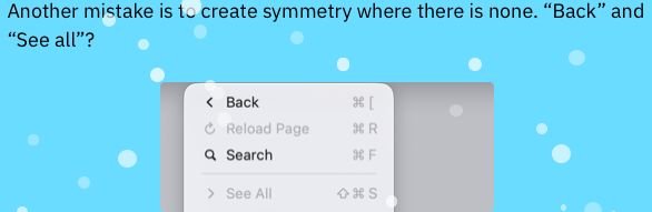
“Back” button and “Show all” icons are straightforward in their given context. Haven’t you used a computer before?

Not mirrored, you dummy. They’re different icons.


Yes, it would. And it did fly back then. I thought you knew this.
I agree? Agree with what? Having delusional thoughts as you type?

It literally tells you what it means you braindead idiot.

Yes really, it makes perfect sense.

Oh no! Look, Apple they decided to switch things up after 33 years, and now it’s a big problem for me! Ever heard of adapting to change even if you don't like it?

No, forward is correct. Recently closed arrow is on the opposite side because it has an extra menu when you hover over the arrow. Did you forget that part? Did you forget how a toolbar works?

Dangerous? How? You're the only one who is saying "dangerous". You're saying this like Macs on Tahoe are about to explode.

Again, this is not that bad. If this is considered “dangerous” to you, then you are just a baby who doesn’t know what real danger means. A paperclip has always meant “Attach File”, and a chain-link always suggest to “Add Link” Huh?

Your attitude makes me Ugh.

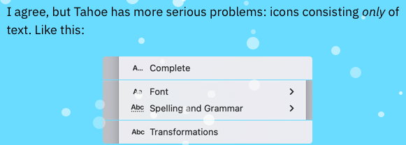
This is the one and only good example you were able to bring up. Did this really inspire you to write your entire blog? Be honest.
Conclusion:
My takeaway is this, it sounds like you have no idea what you are talking about. Nor will anyone else who comes across your blog agreeing with your weak points. My advice is to invest in a newer monitor, one with proper scaling for macOS Tahoe. Revert back to a previous version of macOS if you really need to. Use your computer like a normal person. Maybe even read an entire grade-8 book at least once in your spare time. And You should never complain about UI ever again. You don’t know what you’re talking about. You will never be able to design a better, good-looking, yet usable operating system. You do not have the proper experience or vision.
Personally, I think you read a Jim Nielsen blog and thought that you could do just as good. Spoiler alert: You couldn’t.
Stick to writing programs no one will ever use and mediocre blogging instead, and never use an ugly snow effect on your website again.